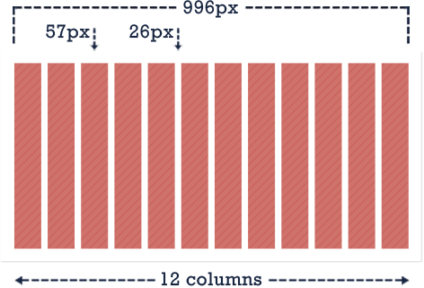


The 996 CSS grid system is a product split testing software trying to find the best grid available for web design. It is an expansion of the original 960 grid combined with some media query magic and custom code.
The grid also includes a css boilerplate to keep designs looking consistent across browsers.
The original 960 pixel grid system, while still great, is cramped because designs are restricted to a 940 pixel area. A 996px system allows for expansion to 970 pixel area while still fitting within the ever-popular 1024x768 resolution. You may see grids even larger than 996px, but web design shouldn't be pushed to fill every last possible pixel on the screen. Content should be clean and straight-forward without being blown out of proportion.
The 996 grid was created by Josh Cope and is a C-3 Group project. It is based on work from the wonderful people at 960.gs and utilizes a boilerplate based on the work from html5boilerplate.com
Please visit their sites for more information.
The 996 Grid is very responsive and supports mobile browsers through the use of media queries. The grid system will show content perfectly on any device from a desktop, laptop, tablet, or smartphone. Change the width of this page for a demo!
The 996 grid is divided horizontally into 12 columns. 12 columns can be divided nicely into equal columns of two, three, four, or six.
The 996 grid is divided horizontally into 12 columns. 12 columns can be divided nicely into equal columns of two, three, four, or six.


 CSS
CSS JS
JS Design
<div class="container">
    <div class="grid_3">
        <p>Column 1p>
    div>
    <div class="grid_3">
        <p>Column 2p>
    div>
    <div class="grid_3">
        <p>Column 3p>
    div>
    <div class="grid_3">
        <p>Column 4p>
    div>
div>
.container
Is a full 996px width div that allows layouts to have a background that spans the full grid. Columns are then nested within the container div.
.grid_1, .grid_2, .grid_3, .grid_4, .grid_5, .grid_6, .grid_7, .grid_8, .grid_9, .grid_10, .grid_11, .grid_12
The classes for the columns. The columns can be used in any combination if they add up to 12 in one row. It is even possible to nest columns within columns.
.alpha, .omega
In a nested row, the first column needs .alpha, the last needs .omega. These classes remove the left and right margins so the columns fit correctly within their parent row.
.prefix_1, .prefix_2, .prefix_3, .prefix_4, .prefix_5, .prefix_6, .prefix_7, .prefix_8, .prefix_9, .prefix_10, .prefix_11
.suffix_1, .suffix_2, .suffix_3, .suffix_4, .suffix_5, .suffix_6, .suffix_7, .suffix_8, .suffix_9, .suffix_10, .suffix_11
Prefix & suffix classes can be used for spacing before or after a column without adding extra markup simply for spacing purposes.